Visualisation: The Changing Face of Giving
Chris Paver –
Data visualisation is a wonderful thing. It can turn big data into simple stories. Some of my favourite data visualisers are David McCandless and Nathan Yau, who teach us that even the most data illiterate person, can learn to understand data with a good visualisation.
That’s what we set out to do recently at Dataro, where we use machine learning, a complex statistical technique, to predict the future behaviour of donors and help charities run better fundraising campaigns. We think there are huge benefits to this approach, so we wanted to make something we could share, which shows-off the enormous value of data in this sector.
What we landed on is a story about how different people give at different times of the year. Let me show you!
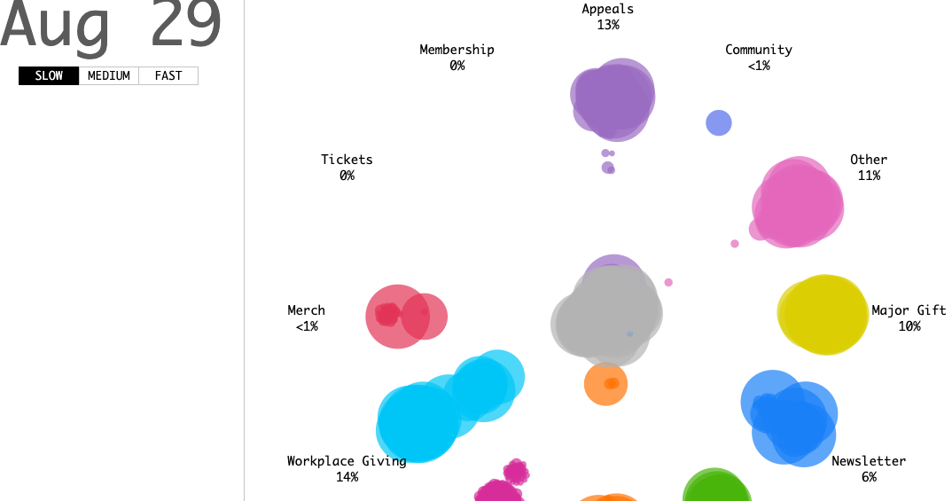
The animation below shows donations given to a single charity throughout a calendar year. The data is actually a simulation of 5000 representative donors for a particular charity (showing you all the data would not be feasible in a single animation). Each circle represents a single donation, with bigger circles representing bigger gifts. The date on the top left shows you when the donation was made. As the animation starts you will notice donations spread out from an initial ‘pool’ of money which gets smaller as each donation is collected into one of 12 main categories of charitable giving. These include Regular Giving (monthly gift subscriptions), Appeals (specific asks at different times of the year), and Workplace Giving (gifts taken directly out of a monthly pay cheque). Now, click below and watch what happens!
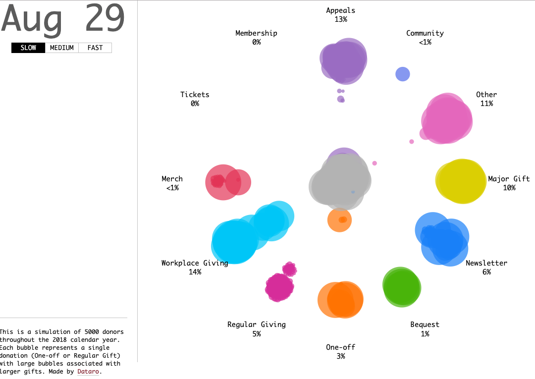
So what did you see? Here are the key take-aways we think this visualisation shows:
- The huge value of commitments (like regular giving and workplace giving). These gifts just keep coming, non-stop and make up a very large percentage of total donations.
- The power of a major gift. Major donations (over $10,000) can have a sizeable impact on the overall results of an appeal campaign. These gifts dwarf some of the other donations around them.
- Appeals ask donors to dig deep. Appeal asks are generally for a specific campaign or cause that is contemporary. Although it seems like a consistent flow of donations across the year, these donations are actually based on roughly 4 specific and targeted campaigns in the year.
Data visualisation allows everyone, regardless of technical expertise, the ability to relate and understand data. Here at Dataro, we pride ourselves on reducing complex data into accessible insights. To find out more, schedule a demo here.

